Visualizing Fish Encounter Histories
By Myfanwy Johnston & Bob Rudis
Project Prep
Packages you’ll need:
tidyverse(or individual components therein:readr,dplyr,ggplot2). Suggested package(s):extrafont,hrbrthemes.
What is an encounter history?
When working with tagged fish swimming in a river, we often generate a record of each fish’s “encounters” with the autonomous monitors in an underwater array. If this in no way applies to your work, you can think of an encounter history as a simple set of Bernoulli trials, with successes (1s) or failures (0s).
Encounter histories are the translation of a fish’s path into a row of ones and zeros, each corresponding to a positive or negative detection record at a receiver location in the acoustic array.
An encounter history data frame might look like this:
##    TagID Release I80_1 Lisbon Rstr Base_TD BCE BCW MAE MAW
## 1   4842       1     1      1    1       1   1   1   1   1
## 2   4843       1     1      1    1       1   1   1   1   1
## 3   4844       1     1      1    1       1   1   1   1   1
## 4   4845       1     1      1    1       1   0   0   0   0
## 5   4847       1     1      1    0       0   0   0   0   0
## 6   4848       1     1      1    1       0   0   0   0   0
## 7   4849       1     1      0    0       0   0   0   0   0
## 8   4850       1     1      0    1       1   1   1   0   0
## 9   4851       1     1      0    0       0   0   0   0   0
## 10  4854       1     1      0    0       0   0   0   0   0
Where each row represents a different tagged fish, and each column represents a different monitor location (“Station”), ordered from the most upstream (the “Release” station) to the most downstream (in this case, station “MAW”). A “1” indicates a successful detection for that fish at that station, and a “0” represents a lack of detection.
A typical pattern of encounter histories for outmigrating juvenile fish is to see the detection rate decline as they migrate downstream and succumb to predation or other mortality factors. However, some fish will miss one monitor upstream only to be detected at one or more monitors downstream. These missed monitors (which look like zeros or NAs in the dataset) are just as important as the hit monitors, and we want to include them in our visualizations.
Prepping the data for visualization
The following code will allow you to download the tidied sample data and visualize it with ggplot2, provided you have all the packages listed below installed.
library(tidyverse)

# download sample data; adjust destfile filepath as necessary.
if (!file.exists("fishdata.csv")) {
  download.file(
    url = 'https://github.com/Myfanwy/ReproducibleExamples/raw/master/encounterhistories/fishdata.csv',
    destfile = "fishdata.csv"
  )
}

(d <- read_csv("fishdata.csv"))
The data frame d now has TagID and Station (monitor) as columns, and the 1/0 detection indicator as the value column.
First, it’s easier to work with both the TagIDs and monitors if they’re ordered factors (remember, the Station order matters, because we want to see the fish go from upstream to downstream):
encounters <- mutate(d,
                     TagID = factor(TagID),
                     Station = factor(Station, levels = unique(d$Station)))
Quick-and-dirty initial visualization
When starting out with a new dataset, it’s always good to see what we’re working with and get some ideas of what we DON’T want:
ggplot(encounters) +
  geom_path(
    aes(x = Station, y = factor(value), group = TagID, color = TagID),
    show.legend = FALSE
  ) +
  facet_wrap(~TagID, scales = "free_x")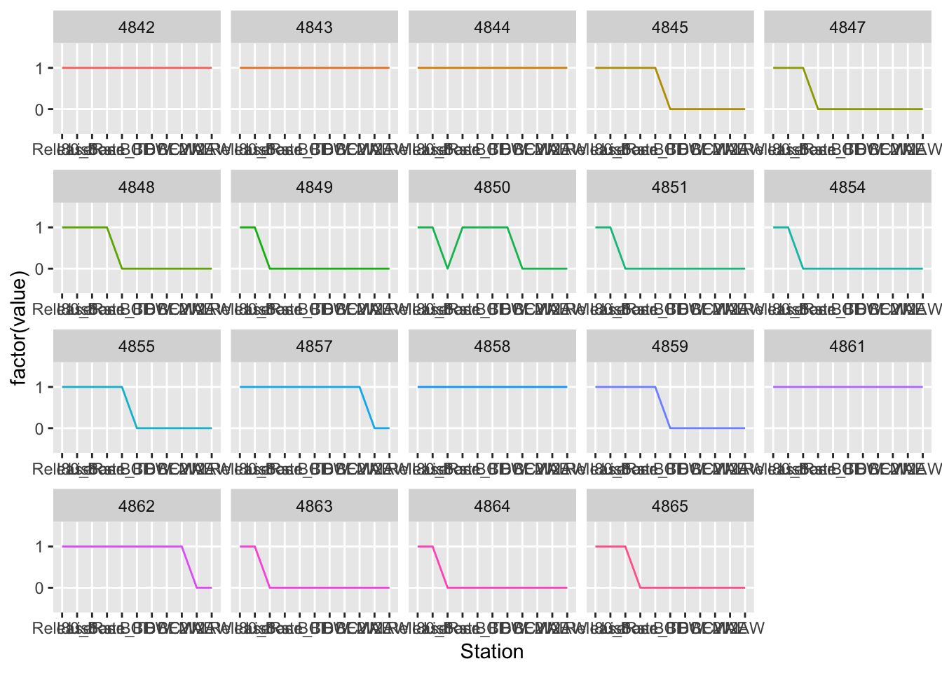
Ignoring the messy axes, we can see that some fish are always detected, some fish are only detected once or twice, and one fish (4850) is missed at one receiver but picked up again downstream. The challenge with this dataset is that we’re not interested in the 0/1 values in a numeric sense…which means it’s a waste of the y axis to use them there.
What we’re interested in is the overall detection trends of the data, especially the “holes” — the zeros for individual fish. It would be much better if each fish could be its own row on the y axis. This would be especially useful for identifying a particular monitor that isn’t detecting fish very well — that monitor may need servicing, or perhaps should be moved to a better spot on the river.
Getting fish together on the same plot
We want to code each fish’s detections as belonging to its own, ordered group of encounters, so that geom_path() can plot them separately. We also want to keep any zeros that exist in the middle of a fish’s encounter history. A handy way to do this in R is to write a custom function that works on a single fish path, and then apply that function to the full data frame of all fishpaths. The function below takes a single fish’s encounter history rows and applies a unique, identifying character string to them:
# Original function author: Bob Rudis

make_groups <- function(tag, val) {

  r <- rle(val) # where 'val' is the 0/1 column

# for each contiguous group:
#   apply flatten_chr() to the letter corresponding to the ith value of the
#   lengths column in r

  purrr::flatten_chr(purrr::map(1:length(r$lengths), function(i) {
    rep(LETTERS[i], r$lengths[i])
  })) -> grps # save as new object

  sprintf("%s.%s", tag, grps) # concatenate the tag and the letter values
# into a single string.

}
It’s important to note that this function only works if you have less than 26 fish; if we had more individuals, we’d have to double up on the
LETTERSvector.
Now apply the function to all fish using dplyr’s group_by():
encounters <- encounters %>%
  group_by(TagID) %>%
  mutate(grp = make_groups(TagID, value)) %>%
  ungroup()
What did that do? It will be most informative to take a look at the fish that had a missed monitor in the middle of its encounter history (fish 4850):
filter(encounters, TagID == 4850)## # A tibble: 11 x 4
## TagID Station value grp
## <fct> <fct> <int> <chr>
## 1 4850 Release 1 4850.A
## 2 4850 I80_1 1 4850.A
## 3 4850 Lisbon 0 4850.B
## 4 4850 Rstr 1 4850.C
## 5 4850 Base_TD 1 4850.C
## 6 4850 BCE 1 4850.C
## 7 4850 BCW 1 4850.C
## 8 4850 BCE2 0 4850.D
## 9 4850 BCW2 0 4850.D
## 10 4850 MAE 0 4850.D
## 11 4850 MAW 0 4850.DThe function did what we asked it to — it looked at all the rows associated with this fish, then checked to see whether that row had a 0 or a 1 in the value column. It assigned a new letter group each time the encounter “streak” changed — that is, as long as the fish was contiguously detected, we see the same letter; the run-length encoding starts over when a 1 changes to a 0 or vice-versa. When we make the plot, these letter groupings will be mapped to the group aesthetic in the geom_path() function, so that contiguous strings of detections can be strung together with a line, and breaks in the detection history will show up as breaks in the line.
If we tried to plot them now, with all the zeros still in the value column, it looks like this:
encounters %>%
  ggplot(aes(x = Station, y = TagID)) +
  geom_path(aes(group = TagID), size = 0.25) +
geom_point(shape = 18, size = 2) 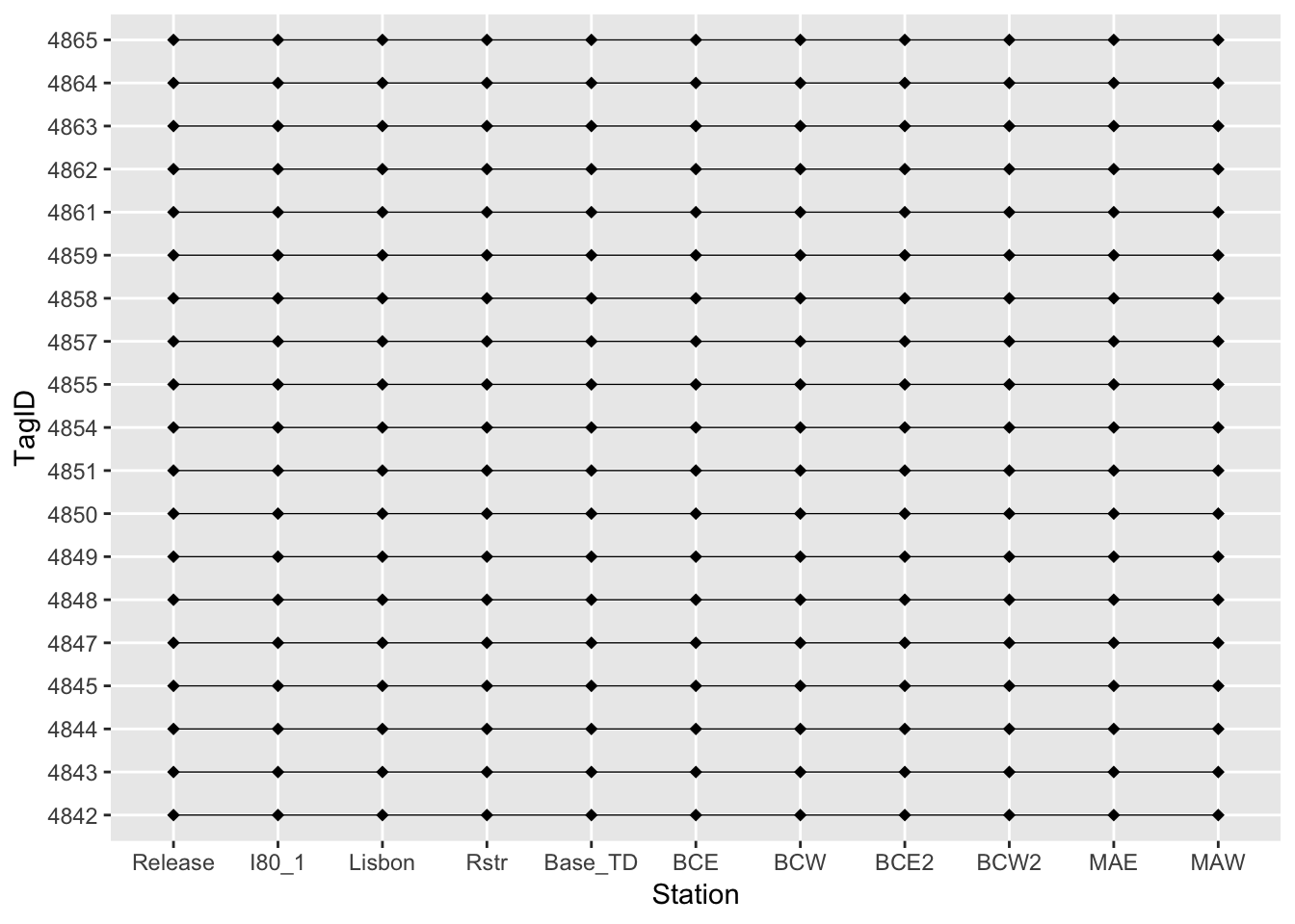
Closer than our initial plot, but R is recognizing the zeros as points on the plot, when really what we want to view is the absence of those points. Let’s filter out the 0s:
group_by(encounters, TagID) %>%
  filter(value != 0) %>%
  ungroup() -> encounters2 # save this as a new data frame
…And, then, plot again. This time, the theme_ipsum() from hrbrmstr’s hrbrthemes package will take us a long way towards a great-looking plot right off the bat:
ggplot(encounters2, aes(x = Station, y = TagID)) +
  geom_path(aes(group = grp), size = 0.25) +
  geom_point(shape = 18, size = 2) +
  labs(title = "Encounter histories of tagged Chinook salmon smolts",
       subtitle = "Upstream to downstream") +
  hrbrthemes::theme_ipsum()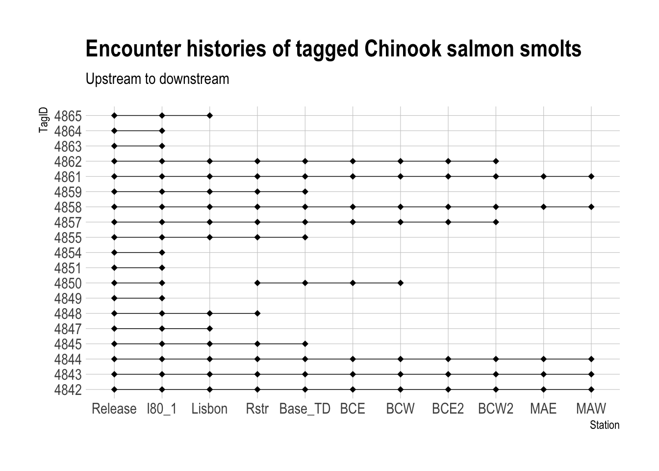
Yay! Now we can see where each fish stopped getting detected along the river, and continuous detections are strung together visually. Much more helpful.
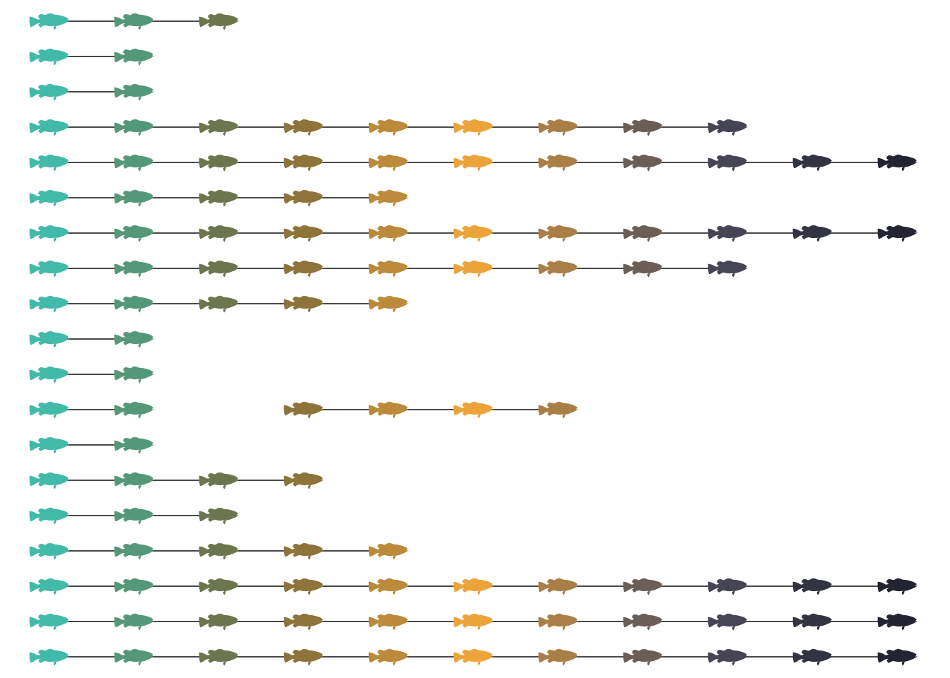
Adding the fun factor
Let’s put some actual fish shapes on the plot going down their paths. There are a few ways to do this, but one is to install the “Le Fish” font (available for download here) on your computer, and then register it with R via the extrafonts package. For detailed instructions on how to install a custom font, check out this page here.
Once you have the font installed and registered, you can call it onto your plot with geom_text():
library(extrafont)

ggplot(encounters2, aes(x = Station, y = TagID)) +
  geom_path(aes(group = grp), size = 0.25) +
  geom_text(label= "X", size=9, vjust=0.6, family= "LEFISH") +
  labs(title = "Encounter histories of tagged Chinook salmon smolts",
       subtitle = "Upstream to downstream") +
  hrbrthemes::theme_ipsum()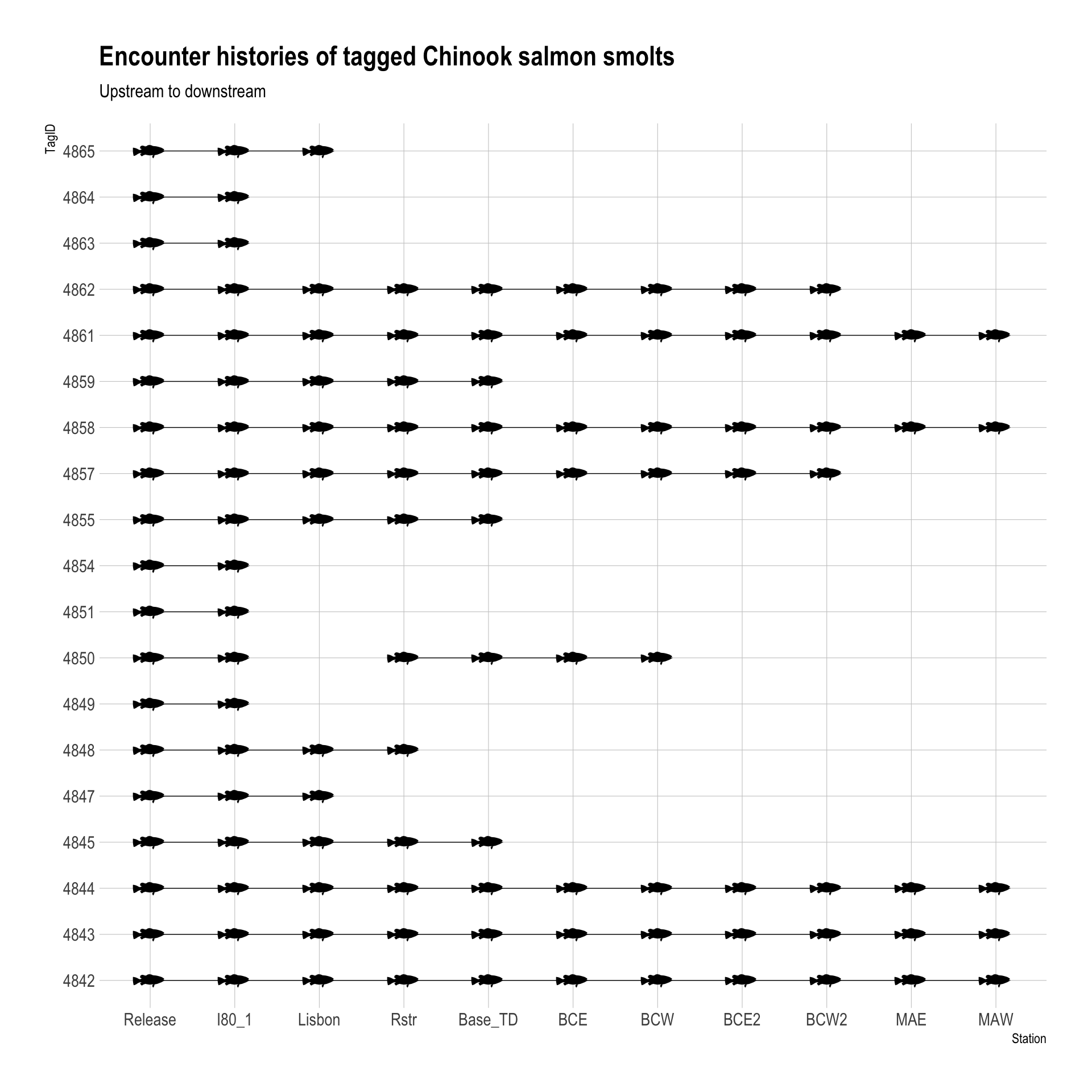
Hope this was helpful!